
From speed limits and warning triangles to familiar blue motorway signs, they’ve become such a normal part of driving that we rarely stop to think about them. But UK road signs haven’t always looked the way they do today – and their story is more interesting than you might expect.
In fact, if you’d taken a drive around Britain 100 years ago, you might barely recognise them.
Before cars, there were barely any signs
In the earliest days of travel, roads were mainly used by horses, carts and pedestrians. Signage was limited, and what did exist was often simple and local – milestone markers showing distances between towns, or signs pointing towards nearby villages.
Once cars started becoming more common in the early 1900s, things quickly became more complicated. Drivers were travelling faster, roads were busier and there was a growing need for signs that could be understood quickly and consistently.
At first, though, there wasn’t much uniformity. Different areas often used different styles, making journeys more confusing than they needed to be.
The problem with too many words
Early road signs often relied heavily on text. That worked reasonably well when vehicles travelled slowly – but as speeds increased, drivers had less time to read long instructions while staying focused on the road.
A rethink was needed.
The breakthrough came in the late 1950s and early 1960s, when the UK began redesigning its road signs to make them easier to understand at a glance. Rather than relying on lots of wording, designers started focusing on symbols, shapes and colours that drivers could recognise instantly.
It’s a big reason why today’s signs feel so familiar – even when you’re driving somewhere completely new.
The designers behind modern road signs
Much of the system we still use today was shaped by designers Jock Kinneir and Margaret Calvert. They were tasked with creating signs for Britain’s growing motorway network, but their influence quickly expanded to road signage more broadly.
Their approach focused on clarity above all else.
The typeface was designed to be easier to read at speed. Symbols became simpler and more universal. Colours were chosen carefully to help drivers understand information quickly.
That’s why:
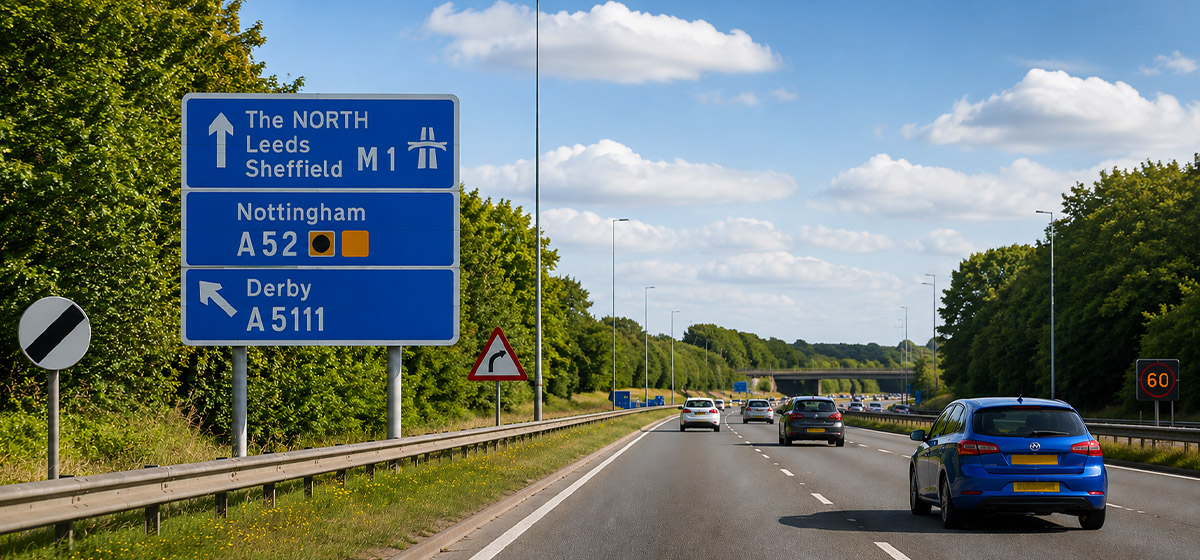
- Blue signs are commonly used for motorways
- Green signs often appear on major A roads
- Brown signs usually point towards tourist attractions
- Red-bordered signs tend to signal warnings or restrictions
Even the shapes have meaning. Circular signs generally give orders, triangular signs warn drivers, and rectangular signs provide information.
Once you notice the pattern, it becomes hard to unsee.
Why road signs still matter
Modern sat navs have changed the way many of us navigate – but road signs still play a crucial role. Diversions, temporary restrictions, hazards, speed changes and unexpected road layouts often rely on physical signs rather than digital instructions.
They’re also designed to work quickly. A familiar symbol can often communicate more effectively than several lines of text – especially when you’re concentrating on driving.
It’s one reason why road signs are designed to be simple, consistent and easy to recognise wherever you are in the country.
What’s the UK’s most unusual road sign?
The UK has its fair share of unusual road signs, but one of the most distinctive is the ‘wild ponies’ warning sign found in parts of the New Forest.
Rather than the standard silhouette used for many animal crossings, it reflects a very local reality – free-roaming ponies regularly wander onto roads in the area.
It’s a reminder that while most UK road signs follow strict rules around shapes and colours, some still reflect the unique character of the places they’re found.
The next time you’re driving…
The next time you’re out on the road, it’s worth paying a little more attention to the signs around you. Many of the designs we still use today have barely changed for decades – proof that simple, clear communication often works best.
And while most of us only really think about road signs when preparing for a theory test, understanding what they mean (and why they look the way they do) can make driving feel just that little bit easier.
Whether you’re following familiar signs or heading somewhere new, make sure you’ve got the right cover before you set off.